Showing posts with label book covers. Show all posts

Tuesday, May 2, 2017

10 Books With Food Or Drinks On the Cover

Sometimes I have these things that instantly catch my eye when I'm browsing book covers. One of those things is FOOD. Maybe it's because I am very passionate about food (especially dessert) but my eye is always drawn to covers with food on them.

So I'm going to share 10 books I've read or are on my TBR that have FOOD on the cover. I take no responsibility if your stomachs start grumbling. I'm pregnant so imagine how hard it is for me to put this together! SORRY NOT SORRY.

Also tell me down below what are those things on covers that instantly attract your eye! 

-- Jamie


What food covers did I miss?? Leave em below!


Tuesday, June 24, 2014

Top Ten Things We Like/Dislike On Our Book Covers


To learn more about Top Ten Tuesday or see the list of future topics click here.


Today we are talking about things we like and dislike on book covers!


 Things We Like:


Jamie likes....amazing typography. I'm a sucker for covers with great typography whether it's the sole focus or blends in perfectly with another subject on the cover.


Jamie likes....when the cover cleverly ties into something in the story. Recently Life By Committee by Corey Ann Haydu did this and I was reminded how much I love when a certain scene or detail is somehow incorporated into the cover.

Julia likes... when book covers clearly show what genre the book is. So when I am browsing the romance section and I see a cover like My Lady Quicksilver by Bec McMaster, I can clearly tell this has an edge of Steampunk.

Jana likes... when the book cover is illustrated (Like Shadow and Bone) more than when it uses photos. It just comes off as being more creative to me.

Jana likes it when cover designers get clever/bold with color. So many books are dark. If I look at the spines on my shelf, they all kind of blend together in a dark glob. And then BAM: a hot pink or bright yellow cover! So fun.

Things We Don't Like:


Tahleen doesn't like.....Whitewashing. Obviously. I hate it when this happens, but I'm glad people are noticing and calling out the publishers/book designers when it happens. In some cases, like Jaclyn Dolamore's Magic Under Glass and Justine Larbalestier's Liar, it's enough to get it changed.

Tahleen doesn't like..The half/partial face thing, especially if there are two faces kissing. I just don't want to look at these. There is usually nothing interesting about them, except for the rare occasion when the cover is cleverly done, like What's Left of Me by Kat Zhang.

Tahleen doesn't like.....The girl in the ballgown. Especially if the book doesn't include a ballgown. This trend is really going to date the books that sport those kinds of covers.

Jamie doesn't like....when the people on the cover don't match the description of the characters IN the book. It's bad enough if I'm seeing faces (because than that's how I'm picturing them) but seriously...why would the blonde MC being a brunette on the cover?

Jana doesn't like pretty much all movie tie-in covers. I like the original cover! I don't care about pretty celebrity faces. The book is always better anyway.

Jana does not like the trend followers. Like Tahleen said, there's a lot of half/partial faces and ballgowns on covers. There's also a lot of the same cover models, the same stock images, the same conceptual ideas (like pale hands holding various non-pale items like apples and flowers...), the same color schemes, etc. I love it when a designer chooses to be different.

What things do you like/dislike when it comes to covers and cover trends? Agree/disagree with us??


Tuesday, May 6, 2014

Top Ten Book Covers I'd Frame As Pieces of Art


To learn more about Top Ten Tuesday or see the list of future topics click here

Top Ten Book Covers I’d Frame As Pieces of Art:


Jen's Picks: 


If I would have planned this better I totally would have gone to a bookstore and just walked around looking at all the book covers I’d like a print of to hang on my wall. Instead I scoured my bookshelves and GoodReads.


Across the Universe by Beth Revis: How can you not LOVE this cover??


Twenty Boy Summer by Sarah Ockler: The heart shaped sea glass on the cover is a perfect fit for the book and a spot hanging on my wall. 

  
Shiver by Maggie Stiefvater: The simplicity of the cover makes it so great.


Oh, The Places You’ll Go! by Dr. Seuss: This would be good to hang in an office or someplace you'd see it when you needed a boost of motivation.


Alice’s Adventures in Wonderland and Through the Looking Glass by Lewis Carroll: This clothbound version is super super super pretty! I’d hang a canvas painting of this cover on my wall for sure.


Jamie's Picks


I'm just obsessed with the simplicity and beauty of this one. If the heart was something I stumbled upon on Etsy I would buy it and hang it in my home.


  I haven't read this (I own it!) but this cover change for the paperback is BEAUTIFUL.

Kimberly's Picks

 Sea Glass by Maria V. Snyder: Isn't it just gorgeous? I love the color and simplicity. 


The Book Thief by Markus Zusak: This is my favorite edition of the book, I love the imagery, young girl with a book, sepia toned with the contrast of the rust colored curtains.


    For Darkness Shows the Stars by Diana Peterfreund: Normally I don't care for the "prom/fancy dress clad girl with devastatingly beautiful face" covers. But this is so much better. It's simple and beautiful.


    What book covers would YOU hang as art work because they are so beautifuuuuul?


    Tuesday, November 12, 2013

    Top Ten Covers We Wish We Could Redesign

    *Before we get started with TTT, have you seen that signups are open for our 4th annual Secret Santa??*


    To learn more about Top Ten Tuesday or see the future topics, click here!

    Jamie's Picks


    1. Another Little Piece by Kate Karyus Quinn


    I don't have a problem with the cover itself (I actually think it's REALLY pretty!!!) but I want something a little gorier looking instead of this pretty girl there. Something to reflect the strangeness of this story!

    2. Something Like Normal by Trish Doller

    This is one of my most favorite books and the cover just makes it look like a romance (which I love) but this book is SO much more than this! I actually think it's a story some guys would dig but the cover totally is offputting to them. Travis is SUCH an amazing narrator. I don't know how I would redesign it but I would make it less of a  kissing cover. Maybe the dog tag incorporated because I like that?


    3. The redesigned Delirium series covers


    I know these have already been redesigned but the face is just SO BORING. I would rather go back to what the old Delirium cover looked like. There's just nothing TO the cover here. It just lacks the spark and blends in with all the other face covers.


    4. Any cover that doesn't reflect the MC -- like whitewashing or when it's an MC that is not a thin person yet the person on the cover is. I want them all changed.


    Paula's Pick:

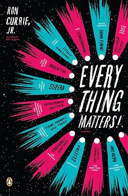
    5. Everything Matters! by Ron Currie, Jr.

    I am listing this as a case where a redesign was unnecessary. The original cover (on the left) is so much more eye catching to me. It was the one that made me pick up the book and go "hmm what's this..." where as I would walk by the redesign in a second. Which is a shame because I would walk by one of my favorite books without even giving it a glace.


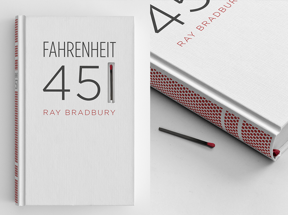
     6. Fahrenheit 451 by Ray Bradbury

    This is a redesign that I wish were real instead of concept art. Artist Elizabeth Perez designed this cover of Fahrenheit 451 that I saw on tumblr that I wish I could actually own. Man oh man it's beautiful.


    7. And while it's also not a "redesign" I would also love for the Harry Potter series to be released in a leather bound set. I have actually dreamed of owning one. And let me tell you how disappointed I was when I woke up and found that they are not a thing that exist.

    There is concept art on the internet of House themed sets of the books. Come on JK do you know how many fans would buy these in a heart beat?
    Let me have a Ravenclaw set pretty please!

    Bridget's Pick:
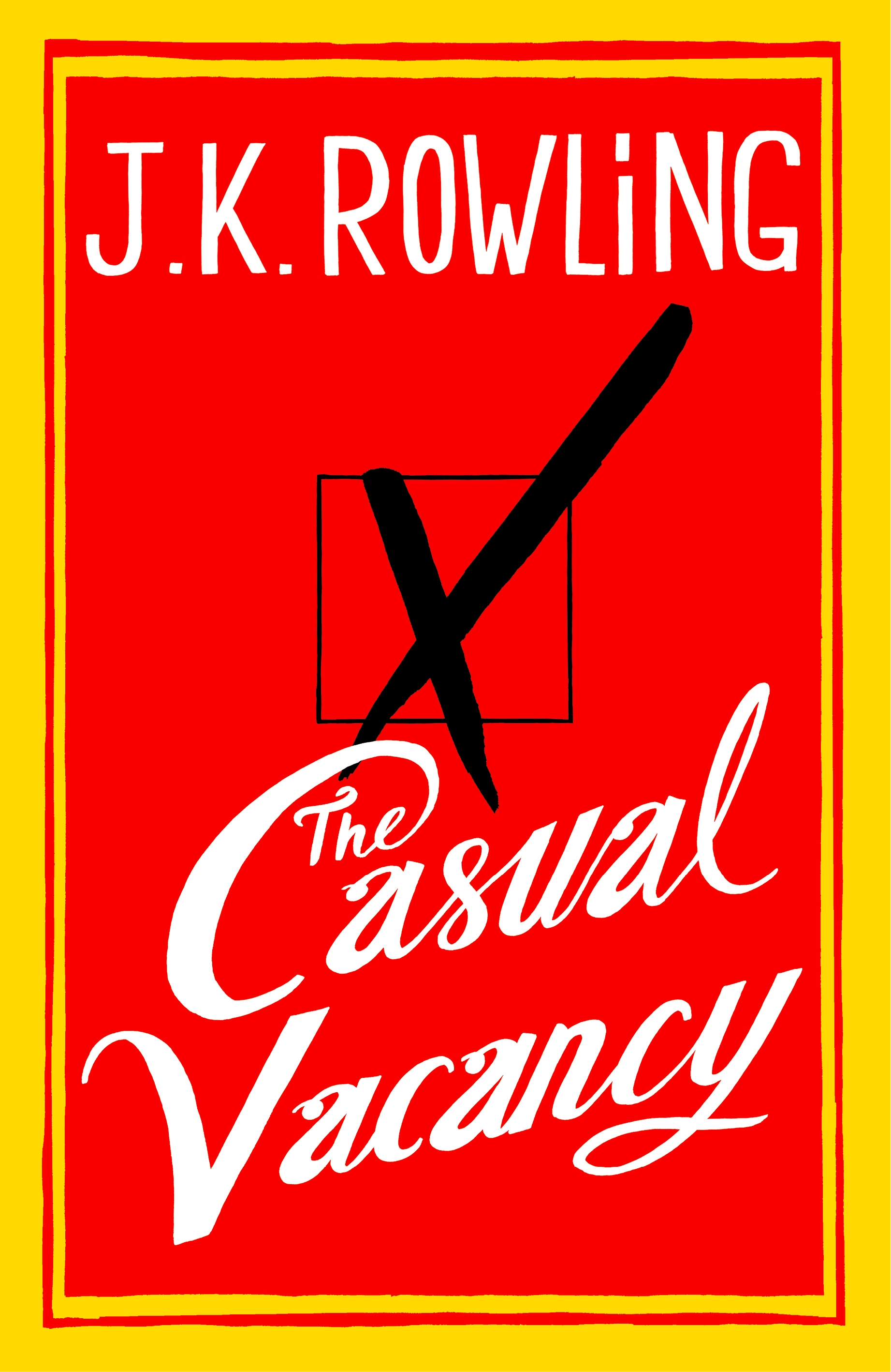
    8. The Casual Vacancy


    I just find this cover kind of boring...I wish it had been something a little more engaging. 

    9. I also wish I could UN-redesign every book cover ever that shows a still from the movie made from the book when the original book cover was miles better (as it always is). 


    10. Tahleen's Pick:


    I really hate this cover, especially because the book itself was so good. It's a historical fiction novel within a historical fiction novel; a girl in the 1960s travels back to the 1800s and is mistaken for a slave, even though she is white. Anyway, I think this cover probably has turned off at least a few people.


    Do you agree with any of our picks? Disagree? Which ones do YOU wish you could redesign?


    Wednesday, March 20, 2013

    how do you feel about cover re-designs?

    Hello, all! It's Jana, here today to talk about something that happens in the book world that almost always drives me nuts. Cover re-designs. I'm sure you all know about the recent unveiling of Stephanie Perkins's new Anna and Lola book covers. I discussed it on my blog, if you missed it. Anyway, this announcement made me start thinking of all the other covers that have been made over throughout the years. It kind of drives me nuts! Here are my main points on this issue:
     
    1. It's confusing to people who do not keep up with bookish news. My mom recently bought a book by her favorite author. Turns out it's the same book she read years ago, but with a new cover.


    2. It destroys the brand identity of that book. Yes, Anna and Lola's covers were pushing it a little, and I didn't love them... but they became iconic. Everyone knew exactly what those covers looked like. We readers only have a title, author, and picture to go by when we browse bookstores. Everyone knows that pictures linger longer in our minds than names do. When I went looking for Twilight in my local bookstore years ago, I just remembered it had pale arms and hands, and an apple on the cover. I did not know the name, and I did not know the author. I went in and asked for the book with that cover, and the bookseller knew immediately. We know our books by their covers, just like we know our friends by their faces. If you change that, confusion happens. It's almost deceptive. 


    3. If you're going to re-design a cover, PLEASE make it better than the original. At least then we can kind of understand the change. But if it's uglier, please leave it alone! Take Across the Universe by Beth Revis, for example. The book went through three cover design, and got progressively worse. I love the first one! The second was meh. The third? Please. It does not even look like a young adult romance anymore. It looks like an old sci-fi novel. I get that they want to appeal to a wider demographic, but there were other ways that could have been achieved. 


    Now yes, I understand that sometimes the new covers are nice. Sarah Dessen's books, for example. I like the new covers, even though they all pretty much look the same now. I can handle that change, and I can appreciate the attempt at giving her a specific look and feel. A brand identity, if you will. 


    And sometimes they are a necessary change. My Victoria Holt books have had some major face lifts. But that's to be understood. Some of her books are 50 or 60 years old. That makes sense. But Across the Universe went through two cover changes before book two was even released. Bad planning? Fickle pubs? Who knows? 


    So, I'm going to jump off my soapbox now and give you the floor! How do you feel about this new bookish trend of re-designing covers? Are there any cover re-designs you love or hate? I wanna hear all about it. :)

    Thursday, June 7, 2012

    Daisy Discusses Covers That Have Disappointed Me

    So I know how it goes, 'don't judge a book by its cover' and all that. But here's the thing: secretly everyone does it. Cause it's usually the first thing you notice when you see a book. The cover and the title. Both are SO important if you ask me.
    But enough on that, what I really wanted to share with you all are some of the covers that have disappointed me throughout my reading life of the past couple of years.

    Man, I did not love this book! And the cover is so pretty!! I know, I'm probably a minority for not liking this series, but it just never worked for me and just looking at this cover makes me sad all over again... And seriously, ALL the covers for the books in this series are pretty! I read in a time where I hadn't learned to DNF yet, and I sort of skimmed through to the end, but for some reason the characters and the storyline just didn't grow on me.

    Confession: I am still a sucker for a girl in a dress. I stumbled across this one when I had just finished Libba Bray's Gemma Doyle series and couldn't get enough of the time period of late 1800s-early 1900s, so I thought I would just eat this up. Especially after someone described it as Gossip Girl in 1899. And I was just not feeling it and the story was nowhere near as gorgeous as that dress on the cover... I mean, I want to OWN that dress!

    Look at that cover!! It's SO intriguing! I mean, I absolutely love it! But after reading 200 confusing pages wherein basically nothing happened, I gave up. I was really sad to DNF it, but I just couldn't do it anymore. And I KNOW, I'm probably a minority with this one as well, but it seems to be either hit or miss and for me it just, well, missed.

    So this cover is one that I don't necessarily love. It's just that the cover was misleading (as well as the summary, but we're not talking about that right now). This cover made me expect a cute, fun summer read. And boy, was I DEAD WRONG. It was absolutely not fun or cute or anything remotely resembling either of those adjectives. To be honest, it was a bit depressing. If you're interested in my complete thoughts on it, check out my review on my personal blog.

    This is quite possibly the most beautiful cover of 2010 and I was aching to get my hands on a copy and just devour it, cause with such a pretty cover you couldn't possibly go wrong, right? RIGHT??
    Ahem. So yeah, basically this was 496 pages of an angel obsessing about her boyfriend and just being naive and too stupid to live. In my humble opinion. But did you know that Xavier was really hot? Cause it's mentioned, like, 500 times... For more opinions on this thing, check out my review on my personal blog and Jana's review on her blog.

    So you guys might remember how I had issues with this book? And really, if you look at the cover closely you can see London. IN RUINS! And OMG, I am SUCH an anglophile, any cover that has the Big Ben or the Tower of London or the London Eye or basically, anything that has to do with London, will get my attention. And I love that she's pictured from the back and she's sort of in the shadows being all mysterious and making me say LET ME READ THAT!!! And well, yeah, it just absolutely wasn't my kind of book in the end.


    So, there you go, my personal graveyard of the covers that have disappointed me. And I'm sorry if I offended anyone by disliking one of their favourite books (please don't yell at me...), I am very much aware that a lot of people have actually genuinely liked or loved these novels pictured above, but well, it's more interesting when people don't all have the same opinion right?

    Now, tell me, what are covers that have disappointed you? Do you agree with me on some of these?


    Related Posts with Thumbnails