 Top Ten Tuesday is an original feature/weekly meme created here at The Broke and the Bookish. Everyone is welcome to join in. Please be kind and link back to us. Sign the Linky widget so that you can peruse other top ten lists from fellow bloggers and comment on others lists! Don't worry if you can't think of ten--add as many as you can!
 This week's Top Ten is-- Top Ten Favorite Covers
I am SO excited about this blog post! I'll proudly and openly admit that I judge books by their covers. What can I say? I'm a graphic designer! It's my job. :) If a book has a good cover, I'll buy it (unless the subject sounds totally uninteresting--I do have my limits!). If it has a bad cover, I'll have to be talked into buying it... and I mean you'll have to give me a REALLY good reason. I wouldn't say I'm obsessed, necessarily, but I do think that's the best diagnosis... I've analyzed the imagery, symbolism, color combinations, typography, level of unique-ness (I know... that's not a word.), and how all those elements work together to create MY favorite covers!
P.S. These are in no particular order. It was hard enough narrowing it down to ten, so don't ask me to put them in order too! You decide which you like best!
P.S. These are in no particular order. It was hard enough narrowing it down to ten, so don't ask me to put them in order too! You decide which you like best!

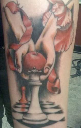
I know, I know. We’ve seen enough of this book cover, it has been forever engrained in our minds, and it’s not terribly exciting. That’s the reason this cover is SO good! According to Stephenie Meyer’s website, “the apple on the cover of Twilight represents "forbidden fruit." I used the scripture from Genesis because I loved the phrase "the fruit of the knowledge of good and evil." The nice thing about the apple is it has so many symbolic roots… Apples are quite the versatile fruit. In the end, I love the beautiful simplicity of the picture. To me it says: choice.” Have you noticed that it has become part of society? I’m seeing knock-offs of this image (like on other book covers or highway billboards with someone holding something else, etc.), not to mention that people are WEARING this image. I wouldn’t be surprised if someone, somewhere has this tattooed on themselves. Oh, I was right! Look! Everyone recognizes it, even if they have not read the book. It’s everywhere. VERY effective.

Shiver , by Maggie Stiefvater
I’ve always loved this cover! Truth be told, the cover was the main reason I decided to give a werewolf teen romance a chance.
So often, covers are based off of a photo. This one is strictly vector imagery and I think it’s stunning. The monochromatic use of a light, smoky blue reflects the feeling of the book itself. This book deals a lot with the feeling of being cold, hence the title. We see a werewolf peeking through the trees—another element of the book. The woods are very important in the book, so it’s very appropriate that they be on the cover. The heart-shaped leaves indicate the hint of romance. The blood drop used for the “i” in the title adds an interesting focal point to the otherwise monochromatic color scheme. The sequel to this book, Linger, is very similar. It’s also monochromatic, but done in green. They look very nice sitting next to each other on my bookshelf! LOVE this cover!
 The World Without Us
Look at the concept we have here! I love it! This book talks about how the earth would respond without us being here, beating it up. What an appropriate book cover design. On top, we have a cityscape in silhouette, creating an emphasis on the polluted air around it. Reflected in the water is a green landscape and a beautiful blue sky—essentially the way the earth wishes it looked. That reflection is the only color on the book cover, creating a focal point. I think the cover makes us think just as much as the book itself. If an image so simple can make you think, even for a minute or two, it’s successful in my opinion!
 Halo
HaloLook how pretty this is. :) I don’t really have a whole lot to say about this one. Since it's being released on August 31st, I’ve never read it, just ooed and ahhed over the cover a few times on Goodreads. Obviously, it’s about an angel. I love the typography used for the title and author, surrounded in the swirls. I love the lens flare between their faces, emphasizing a love story of some sort. I’ve seen this done in wedding photography and I love the concept. I think the wings on the angel are absolutely stunning! I'm excited to get this when it comes out next month!
 The Opposite House
Again, I’ve never read this. A reviewer on Amazon says, “The novel is mainly about Maja, an Afro-Cuban girl who emigrated from Cuba to England when her father began to feel that Castro's government was not going to let him live the life they desired… Maja was four when she arrived in London and as the plot unfolds she has only a few confused memories of Cuba. In school this is an issue because she is the descendent of slaves brought to Cuba-so her heritage is African, but she has never been there at all. This causes her to struggle with her identity and confuses her ideas of where her life should be going. Her best friend is from Trinidad and her boyfriend is a white Ghanaian.” Based on this description, both the title and cover symbolically illustrate the story. The upside-down city street is very intriguing and the simple typography does not deter from that.

Pegasus , by Robin McKinley
I’ve taken a ton of art history classes and some of my favorite paintings focus on landscape and light. I love the treatment of both in this painting. This is such a small book, but doesn’t it look like you could just step right into that world? I also love that the layout forces the eye to focus on the title in the center. The clouds on the right and left, the Pegasus on the top, and the girl on the bottom frame “Pegasus”. The title is in a deep red, making it pop from the sky. I love that font, by the way… with the custom lowercase “s” at the end. Lovely. Everything is so nicely centered and symmetrical. The book is about the strong bond between Pegasi and humans. To me, the cover symbolizes the union of the sky and the earth—Pegasus and human.

Graphic Artists Guild Handbook: Pricing and Ethical Guidelines , by the Graphic Artists Guild
This was one of my college textbooks! I always got so many comments from my friends on the differences between their boring textbooks and mine. It’s so much fun! The bright colors make it noticeable. The head is filled with everything a designer should have a knowledge of. The word “fees” is shown coming out of the mouth because once you’ve read this book, you should be able to discuss your price strategy with your clients. It’s really quirky and fun.
 Over the Moon
I think this is so pretty. This is a young adult paranormal romance about a girl who falls in love with a boy who is basically an alien. The girls is shown looking up at the sky, indicating her love for him but also pondering the kinds of choices she has to make. I like the simple typography and the little orbit that goes around “the”. There’s not a lot to say about this one. Lol. Don’t you think it’s pretty?

The First Word by Christine Kenneally
This book talks about the origins of language. I love that the little figures turns into the first letter of our alphabet. We’ve all seen the origins of man and how the monkey turns into the human. We’ve even seen some spoofs of that one. But I’m not sure I would have thought to do the evolution of the letter! It’s so clever!

Marcelo in the Real World , Francisco X. Stork
This cover was done by the same guy who did Shiver’s cover! I just learned that this morning. No wonder I like it! Once again, we have a vector-based image with a lot of blue and one extra color that creates emphasis. The book is about a teenage boy with Asperger’s Syndrome. His parents push him into the “real world” and encourage him to get a summer job. During the summer, he learns a lot about himself. I love the symbols in this cover! Marcello is being led from his treehouse and towards the road, symbolizing his transition into adult life. The light is on in the treehouse, inviting him back when he needs it. The starry sky symbolizes the oncoming morning—the new day for him.
Sorry… I could not settle on just 10 covers. I had to add an 11th.

Everlasting , by Angie Frazier
The moment I saw this, I thought of two things. 1. OH MY. I love that font a lot. 2. The Little Mermaid. The cover looks like a fairytale to me, which is what the book is! The title is inside a circle, which symbolizes eternity because a circle never ends. It just goes around and around and around, with no breaks in it. Inside the circle is an old map, which is a really nice touch. Combining the map and the circle, to me, symbolizes forever and wherever. Sounds like a strong love to me! I love the color combination and the whispy, airy feel. SO pretty. :)
I used a lot of restraint to not add numbers 12 through 3,721. I've got so many favorites, but I highlighted these ones because I actually had something to say about them. There are other covers I love just because I do! It could be because of a really awesome storyline, some glitter, some embossing, etc. Book covers are amazing because they visually represent the story you're about to dive in to!
So now... tell me what your favorite book covers are! You don't even need a reason. :) Sometimes you just love something!
COMING UP NEXT WEEK: Top Ten Favorite Books of All Time
The Halo one is so pretty!!
ReplyDeleteGreat list!
I was actually getting a little nauseous looking at the cover of The Opposite House, lol.
ReplyDeleteGreat list! I like that Everlasting one as well? Is that book out yet?
ReplyDeleteOh definitely agree with Halo, Pegasus, and Everlasting! Gorgeous!!
ReplyDeleteNicely done! Working on mine now, I hope I can finish in the next 10 mins... I have to get to class!
ReplyDeleteI agree, the Halo one is awesome!
ReplyDeleteAnnddd even though I'm not a Twilight fan, I've always liked their covers. Deceitful! :)
Mouse, I know the feeling. I kind of experienced the same thing. But it's cool, nonetheless!
ReplyDeleteSavannah, Everlasting IS out! I bought it as soon as I could, but I've got other books in line ahead of it.
I think I need to buy Halo...
The Opposite House cover is awesome!
ReplyDeleteHalo and Everlasting look amazing! Maybe I'll have to add them to my to-read list..
ReplyDeleteI think that the firewall here is blocking some of these covers. Phoo.
ReplyDeleteI can definitely see where the cover of Everlasting would remind you of The Little Mermaid. And I love the cover on Marcelo - I think I'm going to have to read that book now.
Yeah. I totally read books based on their covers. And the subject matter, too - I'll ignore a cover if I like the subject or the story, but there's just something so lovely about reading a good book with a beautiful cover. Texture is important to me, too - I like matte covers much better than glossy, usually.
April-Lyn, you sound like me! I'll ignore an ugly cover if I like the story, but I tend to gravitate towards pretty covers. I pay attention to texture as well. I'm sad your firewall is blocking some of the covers! Look them up on Amazon. :)
ReplyDeleteFinally got mine done!
ReplyDeleteGreat post. I love Halo and Pegasus covers. They are both really cool. :)
ReplyDeleteOk. Halo just drew me in enough with that cover to immediately add it to my TBR list. If only so I can look at the pretty for a while.
ReplyDeleteInteresting Top Ten idea! Come check mine out...
ReplyDeleteAccidentally put the wrong URL for my answers... should be: http://myreadersblock.blogspot.com/2010/07/top-ten-tuesday_20.html
ReplyDelete+JMJ+
ReplyDeleteThat cover on Opposite House is both mesmerising and wonderfully offbeat!
And I also really, really like Pegasus. =)
I've never heard of The First Word but it looks interesting!
ReplyDeleteAnd I confess, covers make me want to read books more (or less).
Some gorgeous covers there. Especially like Pegasus, Halo, and Over the Moon. Might have to check those out.
ReplyDeleteI really like Marcelo in the Real World and Shiver.
ReplyDelete